Menu Items
These properties provide options to customize the formatting of menu items. For Static menu items, you can click on the ⚙️ gear icon to access the configuration options. For Dynamic menu items, you can click on the Configure Menu Item button to configure the properties.
Content properties
These properties are customizable options present in the property pane of the widget, allowing users to modify the widget according to their preferences.
Basic
Label
The Label property is a group of customizable settings that define the main text displayed on the widget. string
The Label property is used to set the text label for a menu item. It can be a static text value or dynamically bound to a data source. For instance, you can set the label to be the name of a page or a user.
onClick
Allows you to configure one or multiple actions to be executed when the menu item is clicked. You can chain multiple actions together, and all the nested actions would run simultaneously.
Visible boolean
Allows you to show or hide the menu item based on specific conditions.
Disabled boolean
Allows you to disable input for a menu item. This can be beneficial when you want to restrict user interaction with the menu item in specific situations.
Style properties
Style properties allow you to change the look and feel of the widget.
Icon
Icon string
Specifies the icon to be displayed on the button. Additionally, you can use JS to dynamically set the icon. Appsmith utilizes the icons from the Blueprintjs library.
Position string
This property allows you to configure the Icon's placement.
Options:
- Left: Aligns the Icon to the left side of the Label.
- Right: Aligns the Icon to the right side of the Label.
Color
Icon color string
Specifies the color of the icon displayed for the menu item.
Text color string
Specifies the color of the text displayed for the menu item. This property allows you to customize the text color to enhance visibility or achieve a specific visual effect for the menu item.
Background color string
Determines the background color of the menu item.
Reference properties
Reference properties are specific to the menu configuration pane and are not available in the general property pane for the widget. These properties are only accessible when you select the dynamic source data option.
currentItem object
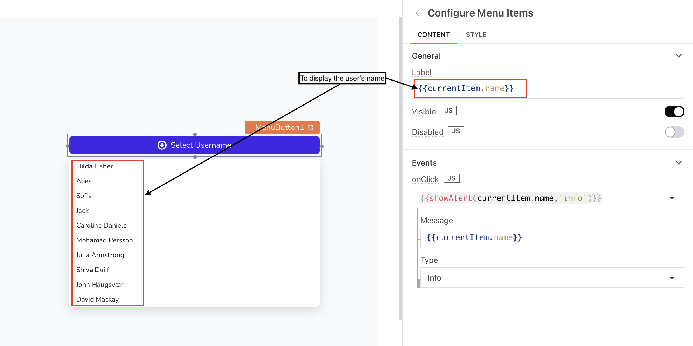
The currentItem property refers to the currently selected item on the menu button. It allows you to access and read the attributes of the selected menu item.

Example:
If you want to dynamically display the label based on the selected item's name, you can use {{currentItem.Name}}, where Name represents the attribute that stores the name of the menu item. This enables you to show different text for each menu item based on its associated data.
currentIndex number
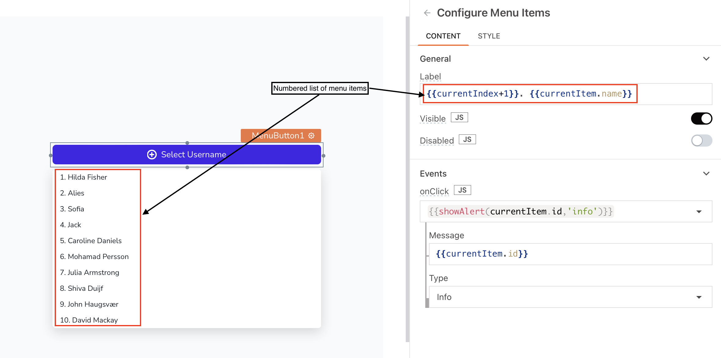
The currentIndex property is useful when you want to display a numbered list of menu items or apply alternate background colors to the menu items. You can use the currentIndex value to determine the index position of the currently selected menu item or to perform conditional styling based on the index value.

Example:
To change the color based on the index, using a different color for even numbers, you can use following code in Background color property:
{{currentIndex % 2 === 0 ? "#22c55e" : "#facc15"}}